Thursday, December 19, 2013

Props


These are two of the main props we used...

We used a red balloon for the clown to hold. This was a vital prop in our opening titles as it is used throughout the titles. We used a red balloon oposed to another colour as red represents danger as its the colour of blood blood. Also a balloon is normally associated with partys, happy events and children, completly opposite to what its used for in our opening titles for horror. We was going to put blood in the balloon so when the clown popped the balloon the blood went all over the woman, however we found that this would be to difficult to do so instead we used it without the blood and it looked just as good.


Another of one our main props was a knife. Knives are perceived as a weapon and danger so we used this because of that. However we also used it as a normal household object by having the woman washing up with it, but having a creepy edge to it when she pours the red fairy liquid onto it.

Wednesday, December 18, 2013

Costumes


This is the clown costume we used in our filming. We chose this as the colours are mainly bright, like an ordinary funny clown. However there is also dark parts of the costume, like the black colar round his neck, this gives the costume a mix of the 'horror clown' and the everyday 'normal clown'. Also the mask of the clown is very scary and brings across our theme of horror.

Costume Analysis

The Clown

The costume that the clown is wearing is very unusual as clown costumes are normally related to children and are perceived as happy and cheerful. However in horror films clowns are portrayed as evil and twisted characterers. They come across as these type of characters for many reasons. One of theses being that the face is covered and you cannot see who the person is, this makes the clown mysterious and unknown. We fear the unknown and that is why we find the clown frightening. The clowns costume is brightly coloured and these bright colours are'nt normally associated with horrors.
Some people are scared of clowns anyway but even people that are not scared of clowns are scared of the fact clowns are ment to be happy but come across as scary. This is strange and confusing which makes people fear them.
The clown hair is bright red, this colour represents anger and is like the colour of blood. It's also a colour of hair that is unusual and strange, which again is unnatural for us so we fear it.

Analysis of Props

I have researched the props used in Scream as this film is related to our horror opening titles, as there is going to be a 'mysterious phone caller'.

Here i have collected various different pictures of props used in the film 'Scream'.

A phone was used in scream because a 'mysterious caller' kept ringing, which soon turned out to be the murderer.

A knife was also in the scene.

A mobile phone was also being used.


I also researched props from the film 'Dead Silence' as this film has a clown in it. This will give me and my group ideas for our opening titles as we are including a clown in it.

There is a radio shown towards the beginning of this film, this links in well with our idea for our opening titles as we are going to be including a radio.


They used various different dolls in there film, this is considered quite unnatural and scary as dolls are normally associated with children which is ment to be bright and cheerful. However in this film the dolls are very dull and eerie.


Thursday, December 12, 2013

Synopsis of My Idea

 Our Idea


Our horror film opening includes a terrifying clown and a ordinary woman. We named our film 'Dead Funny' because its a play on words as 'dead' is a very negative word and 'funny' is a very positive word, meaning they're completely opposite. This should intrigue the audience and hopefully capture their imagination.

Our story begins with a regular housewife cleaning the dishes, in her kitchen.  Her home is just a normal house on a regular street. Nothing out of the ordinary you might think, but her world is about to change! As the camera films the house wife the camera will switch to the clown walking down that regular street. At first his footsteps will be slow and steady. The camera will capture the speed of his movements. 

Next the camera will return to the kitchen scene, where our innocent housewife will receive a chilling call from our evil clown. He will ask if she likes balloons! an innocent question with deadly intent.  Our housewife will ask the regular questions, like who is this? What do you mean? She will hang up but now a niggling seed has been planted in her head. 

The camera returns back to our clown. His footsteps are now picking up pace, he is moving with more purpose, adding to the building tension. A heartbeat can be heard and is speeding up ensuring the audience will be kept in suspense. 

Back in the kitchen the housewife hears the doorbell ring. Already slightly spooked by her phone call she walks slowly to the front door and peers thought the peep hole. Seeing nothing, she slowly unlocks the door and peeps out.  There on the doorstep is a balloon. Stepping out she gently picks up the balloon to examine further. The heartbeat that has been gradually beating faster  and louder suddenly stops when the balloon explodes, saturating the housewife in blood.


Selling points of our film


  • Clowns have recently been featuring in the news a lot, as there has been a lot of clown spottings in many different citys and towns, so we thought that would be a good idea to use a clown in our opening because people would be more on edge watching a film about a clown.
  • We are going to make the film as scary as possible if not people will not want to watch it as its just like any other horror and we need to make it different and new.
  • Many people enjoy watching gory horror films that have a twist and this is what our horror film includes.

Wednesday, December 11, 2013

Our Prezi for our Pitch


This is the prezi we used in our pitch.
We recorded our pitch, and this is our video of us presenting it...

Friday, November 15, 2013

Zombieland Analysis

Click here for Zombieland opening titles

How does the title sequence establish genre, character and narrative?

The title sequence establishes the genre because its in low key lighting which automatically gives the viewer a sense of fear. Also there is a lot of gore in it as it shows zombies eating other humans. Its shows immedietly that a town has be over taken by zombies and that there is only a few humans left and mainly zombies. From watching the title sequence, you can tell there will be alot of gore and you have an overall idea of whats going on.

How does the titile sequence attract an audiences interest?

 The camera shots attracts the audience as some are really close ups of the zombies eating flesh ofother people. Also the voice over is unusual because he is explaining how to survive against the zombies. It intrigues the viewer to find out more as there is a few humans left that need to protect themselves fom the zombies.

What do you consider to be the target audience of the film and why?

 I consider the target audience of the film to be a 15 as there is mainly just gore in it, other than that there isnt nothing else. There is no sexual content or things that could disturb the younger audience.

Who has produced the film and how is that evident in the title sequence?


You can easily tell who produced the film as its appears in red which stands out against the background image.

Thursday, November 14, 2013

Analysis Of Opening Titles

The counjuring


http://www.artofthetitle.com/title/the-conjuring/


When we watched the opening titles for the counjuring it immediatly created a sense of fear as the background music was very mysterious and edgey. As the titles were coming up behind them was news reports of a family and hem moving into a old house. This makes the viewer want to know more as they want to know who the family are and why they were in the news. Also the lighting was all in low key, so was dark and dull, his also put the viewer on edge as we associate dark dull colours with negative and scary things. The images used of the house, on the newsapers were in black and white suggesting that it was in the past and that the house has a history. Throughtout the titles bits of papers and images are being switched and put over a lightbox projector, this suggest someone is showing these papers to a group of people, maybe its now an investigaion whatever happened to this family in the house. So all of this creates a sense of the unknown, and mystery. This intregues the viewers.

Thursday, November 7, 2013

BBFC Ratings


U- Universal
  • Suitable for all ages.
  • Audience- usually 4 and over.
  • If something bad/scary happens, it is immediately counterbalanced with something good/happy.
  • Horror scenes should be very mild and quick- shouldn't be able to cause anxiety with young children (should be reassuring).


PG- Parental Guidance

  • General viewing- some scenes may be unsuitable.
  • Audience- 8 and over.
  • Parents should be able to decide whether its suitable or not.
  • Horror scenes shouldn't be too long or intense.
  • Language should be mild.


12/12A
  • Suitable for 12 years and over, but if a child under 12 wants to watch then an adult must be with them.
  • Can have racist/ sexist characters in but the film must not say them being racist or sexist is right.
  • Drugs misuse- inefficient and should not be glamorised.
  • Language can be mild, but must not be frequent.
  • Moderate violence but must not be detailed.


15
  • Suitable for 15 years and over.
  • No one younger than 15 can watch a 15 film.
  • Strong threat and menace are permitted.
  • A 15 rated film may include; strong violence, frequent strong language, portrayals of sexual activity, strong verbal references to sex, sexual nudity, brief scenes of sexual violence or verbal references to sexual violence, discriminatory language or behaviour and drug taking.
  • There may be racist, homophobic or other discriminatory language.


18
  • Suitable for only adults.
  • No one younger than 18 may watch an 18 film in a cinema or purchase an 18 film.
  • 18 films include the following; very strong violence, frequent strong language and/or very strong language, strong portrayals of sexual activity, scenes of sexual violence, strong horror, strong blood and gore, real sex, discriminatory language and behaviour.

Monday, November 4, 2013

Friday, November 1, 2013

Nine frame analysis


Frame One

When recording this we had to do the shot a number of times because people kept walking past and kayleigh kept laughing, smiling or looking at the camera. After a few times of redo-ing the shot we eventually got the right one. The dinner hall was empty which made the shot more effective as you could here kayleighs footsteps as she was walking. However we ended up putting music over the top to make it more dramatic, therefore you couldnt hear the footsteps.

Frame Two/Three

When recording these two shots, of kayleigh walking through the door, we had to be very careful of where kayleigh was standing and make sure her arms and hands were in the same place through-out the two shots, so the video ran smoothly and the continuity was good. This took us a few shots to get right, but in the end we completed it.

Frame Four

For this shot we wanted to make Jess look very alone and isolated, so we took a long shot of her sitting down with empty chairs surrounding her to emphasise the fact she is alone. We had to make sure the focus was right on the camera so we could see Jess clearly.

Frame Five

In this shot we wanted to have Kayleigh walking up the stairs and then approaching Jess, so we had to position the camera at an angle were the stairs were in the shot aswell as Jess. We had trouble with this part because we started to fade the music out ready for when the conversation between them started. However the music didnt fade out smoothly and was actually quite abrupt, this sounded unproffesional and staged.

Frame Six/Seven

These two shots are demonstrating the 180 degree rule. This shows the on-screen relationship between a character and another character. An imaginary line called the axis connects the characters and by keeping the camera on one side of this axis for every shot in the scene. The first character will always be to the right of the second character, who is then always left of the first character. When watching these clips back, they could of spoke louder.

Frame Eight

When we recorded this shot and watched it back, as Jess was running down the stairs the camera shook and this didnt make our shots look professional. We shouldve moved the camera to a more stable place so the camera did not shake.

Frame Nine

This was our last shot and was of Kayleigh comforting Jess. This shot ended quite quickly and should of been made longer. Also you couldnt really see either of there faces.

Thursday, October 31, 2013

Evaluation

What have you learnt by doing this exercise?


By doing this excersise i have learnt a number of things. I've learnt about different camera angles and why we use them, this is good experience for when i do my final task. I also have learnt how to use Adobe Premier Elements, which again is very useful when i get to making my final task. We learnt that the location and setting plays an important part in making a short video and that we have to think carefully why we have chose that location. I have learnt that its a lot harder to film and put together a short video than you think. The acting in our video could of been alot better and more realistic as it looked quite awkward watching it back. Also the editing is very difficult to get the right shot playing at exactly the right time, along with the music. Our music sounded very odd as it didnt fade out when the speaking started in the shots.

What skills have you developed?

Skills i have developed from doing the Preliminary Task are, how to edit clips, cut them and make the speed up/slowdown. I've also learnt how to use a camera and zoom in and out on the camera, while using a variety of different shots. I have developed editing skills on the Adobe Premier Elements software. Ive learnt how to insert music into the clips and to fade the music. However i do need to practice editing more as i still could improve on my editig skills. I ave also learnt how to use a camera and where to place the camera to get the best shot.

What feedback have you received?


These are comments from some members of my media class.

How would you improve your Preliminary Task?

To improve my preliminary task i would make sure the acting of the characters is better and that the camera doesnt wobble when recording. I would also use more effects on the shots to change the lighting and i would cut the shots so they ran more smoothly.

Wednesday, October 30, 2013

Saturday, October 26, 2013

Friday, October 25, 2013

Pictures of us filiming

We dimmed the lights to try and get low key lighting but this showed green lighting on the camera.


We made the lights brighter so it was clear when we was recording.

Jess was alone in the middle of a large room so she looked isolated and upset.


This was us filming our preliminary task.


Thursday, October 24, 2013

Key Technical Terminology

180 degree rule

In film making, the 180-degree rule is a basic guideline regarding the on-screen relationship between a character and another character. An imaginary line called the axis connects the characters and by keeping the camera on one side of this axis for every shot in the scene. The first character will always be to the right of the second character, who is then always left of the first character.

cut on action

Cutting on action or matching on action refers to film editing and video editing techniques where the editor cuts from one shot to another. Although the two shots may have actually been shot hours apart from each other, cutting on action gives the impression of continuous time when watching the edited film.


eye-line match

An eye-line match is a film editing technique associated with the continuity editing. It is based on the idea that the audience will want to see what the character on-screen is seeing. The eye-line match begins with a character looking at something off-screen, followed by a cut to the object or person at which he is looking.


continuity editing

Continuity editing is the main style of film editing and video editing in the production process of filmmaking of narrative films and television programs. The purpose of continuity editing is to smooth over the natural break of the editing process and to establish a consistency between shots.

Wednesday, October 23, 2013

Planning our Preliminary Task

This a sped up video of us discussing ideas for our preliminary task. We came up with a number of ideas for the task, each with different themes. However we thought horror would be a good theme to do for a preliminary task as there was lots of things we could do to create a scary atmosphere.

After thinking further into our horror idea we realised that it would include alot of unnecassary work, as our preliminay task would not be marked. We came up with another idea to with a simple script that ticks all the requirements which we needed. We wrote a script and decided jess and kayleigh would be the characters in it with me and hannah recording it. We decided our location would be in school, in the theatre as this was easier and it fits well with the Mise en scene.


Moodboard

Here we created a moodboard of different horror themed images, these inspired us with ideas for our preliminary task.


Loacation


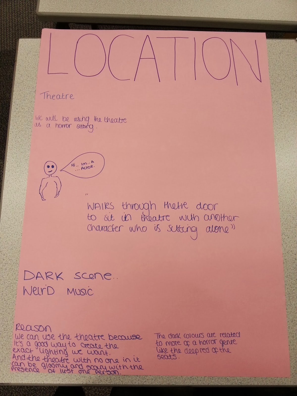
We had to brainstorm ideas of a location to use. We also wrote down things that would make a good horror location and why. We put things down such as low key lighting, to create a dark eerie atmosphere...

Our location

This was our location for our preliminary task. We chose this loaction as the setting for our task was a school, so we then chose the theatre because of the fact its very large. We wanted to chose a large place to film this so we could empahsise the fact the girl feels alone, while she was sittin by herself with loads of charis surrounding her where people could be sitting, but theyre not, and shes completly alone.


Representation

Stereotypes
- 'visual shortcut' repeated so often that we assume they ae normal or true

Archetypes
- this is the 'ultimate' stereotype. eg. the white stiletto wearing, big-busted, brailess blonde bimbo

Countertype
- a representation that challenges tradition stereotypical associations of groups, people or places

Mise En Scene

*a french term meaning what is put into a scene of frame

*visual information in front of the camera

*communicates essential information to the audience

Key Elements

*settings and props
*costume, hair and make-up
*facial expressions and body language
*lighting and colour
*positioning of characters/objects within the frame

Golden Rules

Rule One
If you use Prezi or Microsoft powerpoint to present your work and what you have learnt, don't over use it as there are many other ways to presenting your work, such as in videos or pictures of the work you've done in lessons.

Rule Two
Be as creative as you can with your blog, play around with different fonts, add videos, pictures etc.

Rule Three
Don't copy other peoples blogs, use your own work and don't just copy it off other people or the internet.

Rule Four
Make sure your evaluations are well thought out and use key words.

Rule Five
Try and present what you have learnt in every lesson, to show people that you are understanding what you're learning about.

Rule Six
Make sure your blog is easy to navigate through and it is easy to find every thing you have written about. eg, put titles for all the work you upload to explain what its about.

Camera Angles

MY OWN CAMERA SHOTS

Long Shot

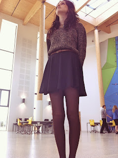
Low Angle

Close Up

Medium Shot

Low Angle

Medium Shot

Long Shot
 
 
CAMERA ANGLES